
Animations are a great way to enhance user experience by making interfaces feel more dynamic and responsive. One everyday use case is a loading indicator informing users that a process is happening in the background. In this article, we’ll explore how to animate a series of dots (.) using CSS keyframes, creating a simple yet effective waiting animation.
The @keyframes rule in CSS defines the steps of an animation by specifying how an element’s properties should change over time. It allows you to create smooth transitions by setting intermediate points (keyframes) between the start (0%) and end (100%) states of an animation. Each keyframe represents a percentage of the animation’s duration, where different CSS properties can be modified.
For example, an animation that moves an element back and forth can be defined with @keyframes, setting different transform values at 0%, 50%, and 100%. When applied to an element using the animation property, it will smoothly transition through these keyframes, creating a fluid motion effect. This method is widely used for creating loading indicators, hover effects, and more dynamic UI elements without relying on JavaScript.
The Loading Concept
Here’s an example:
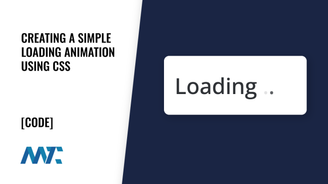
Loading...
The goal is to create a small animation where three dots appear and disappear in a loop, simulating an ongoing process. This effect can be used in various UI elements, such as buttons, status indicators, or loading screens.
Here’s the code:
<span class=”loading-container”>
Loading<span class=”dots”><span>.</span><span>.</span><span>.</span></span>
</span>
Implementing the Animation with CSS
To achieve this effect, we use CSS animations and @keyframes to control the opacity of the dots. Here’s how it works:
.loading-container {
position: relative;
display: inline-block;
font-size: 16px;
}
.loading-container .dots span {
opacity: 0;
animation: loadingAnimation 1.5s infinite;
}
.loading-container .dots span:nth-child(1) {
animation-delay: 0s;
}
.loading-container .dots span:nth-child(2) {
animation-delay: 0.3s;
}
.loading-container .dots span:nth-child(3) {
animation-delay: 0.6s;
}
@keyframes loadingAnimation {
0% { opacity: 0; }
50% { opacity: 1; }
100% { opacity: 0; }
}
How This Works
Container Styling (.loading-container):
The container is set to inline-block so it fits seamlessly within text or other elements.
position: relative; ensures the positioning of the animation remains controlled.
Dot Styling (.dots span):
Each dot is set to opacity: 0 by default so they are invisible at the start.
The animation property applies loadingAnimation over 1.5s, looping indefinitely.
Staggered Delays (nth-child):
Each dot has a different delay (0s, 0.3s, 0.6s).
This staggered effect ensures the dots appear one after another in a looping sequence.
Keyframes Definition (@keyframes loadingAnimation):
At 0%, the dot is invisible.
At 50%, the dot is fully visible.
At 100%, the dot fades out again.
This cycle repeats, creating the effect of moving dots.
The Result
CSS-only animations create a lightweight and visually appealing loading effect without needing JavaScript. It can be applied anywhere in a user interface where a waiting indication is needed.
Why Use This Approach?
Minimal Performance Impact: Pure CSS animations are optimized for smooth performance.
No JavaScript Required: Reduces complexity and improves maintainability.
Easily Customizable: You can modify animation speed, color, or add more dots for a different effect.
This is a great way to add a subtle but effective animation to any web interface, improving the user experience by clearly indicating background processes.
©2025 DK New Media, LLC, All rights reserved | Disclosure
Originally Published on Martech Zone: Creating a Simple Loading Animation Using CSS